Bringing order to a chaotic enterprise design system
Design SystemsEnterprise SaaSConstruction Tech
Context
Planera builds construction scheduling software, the kind that goes up against Primavera P6 and Microsoft Project. At enterprise scale, an inconsistent interface reads as risk. Two attempts at a design system had stalled half-built before I joined; the one I picked up covered about 40% of the UI.
Summary
I started with an audit: why had two attempts died? Then a rebuild from the foundation up. Colours named for intent, components built as masters with variants, and a weekly rhythm with engineering to keep the two in step. 255 tokens, 29 master components, 265 icons, and a reference the team still opens. December 2025 through June 2026.
In this story
- 01Why it kept failingBusiness context · Two prior attempts · The case for an audit
- 02What the audit foundToken audit · Component cross-reference · Icon set · Process gaps
- 03How it got fixedToken architecture · Component rebuilds · Design reviews · Dev QA
- 04What changedDark mode · Adoption · Documentation · Retrospective
Two attempts, both left half-built
Planera had tried twice before I joined. Every colour question was still a Slack thread, and one screen could carry three versions of the same pattern.
01Generic
Assembled from off-the-shelf design system templates, built for a generic product instead of construction scheduling. What did not fit went unused.
02Half-built
Coverage stopped where the templates stopped: about 130 tokens, 40% of the UI, no interactive states, no icon grid.
03Unowned
No SOPs, no design-dev sync, no QA between Figma and code. Nobody whose job it was to keep the system honest.
First order of business: build nothing until I knew why the first two attempts died.
Nothing was built to purpose
The foundations were never built properly, and the system around them was never built for the product it served. Eight problems, ranked by damage.
No consistent scale
Text said Secondary, borders said Medium, surfaces said Regular: three words for the same middle step.
States styled from raw palette
The states were defined, but the tokens used to style them were just blue.500 from the palette. Semantic tokens were not defined properly.
One shade per status colour
Status colours (success, warning and critical) were defined with only one shade. Specific text, background, border and other semantic tokens didn't exist.
The palette had no hierarchy
Brand colours and all the other colours sat at the same level, with no change in their taxonomy.
Icons that never sat right
Each icon carried its own padding, so two icons at the same size looked like different sizes.
Built per use-case, not as masters
Components were created as and when a use case was discovered, instead of one master with variants. For example, changing the construction of an input field meant updating all of the components such as dropdown, search, etc. manually.
No one owned the quality
While adding to the design system, no one assumed ownership to verify if each component was built properly.
Figma and Storybook drifted
The dev sync was ad-hoc. This led to a lot of deviation between Figma and Storybook components.
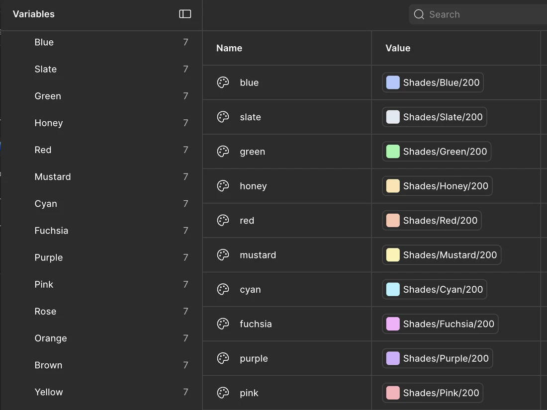
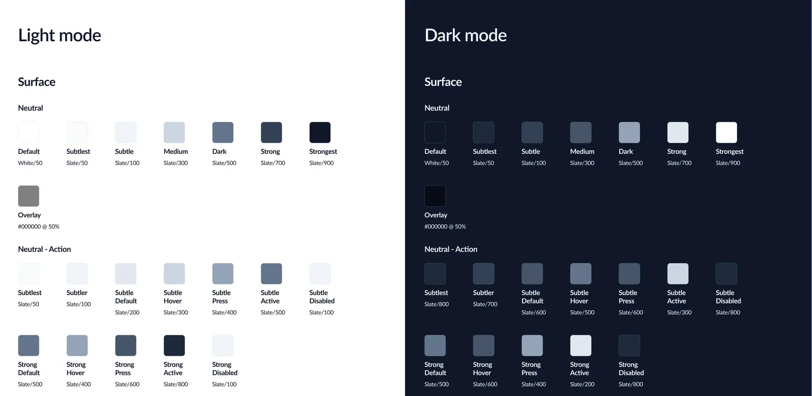
Intent-driven colours, for every use case
It started with the names. Each one leads with the job it does, not the hue it happens to be. Surface, border, text, and icon: the four parts every interface is built from. Each carries its own semantic set, so a name tells you where it goes before you ever see the colour.
01Neutral
Most of the interface. The default surfaces, text, borders, and icons.
02Brand
The highlights. Used for undoubted affordance.
03Status
Feedback. Alerts, toasts, and confirmations carry their meaning in the colour itself.
04Custom
Everything outside the other three: the colours a user can set themselves.
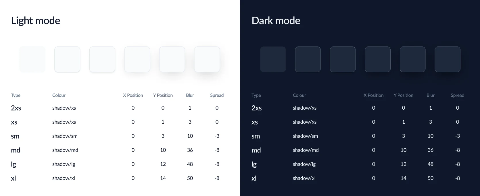
Box-shadow can’t do Multiply
There are workarounds, but on an enterprise system, where a shadow loads on every card, menu, and dialog, they’re the kind of UI jazz nobody needs. I re-created shadow styles that were 90% the same as the multi-layer ones, using a single layer.
Every component became a master, every use case a variant
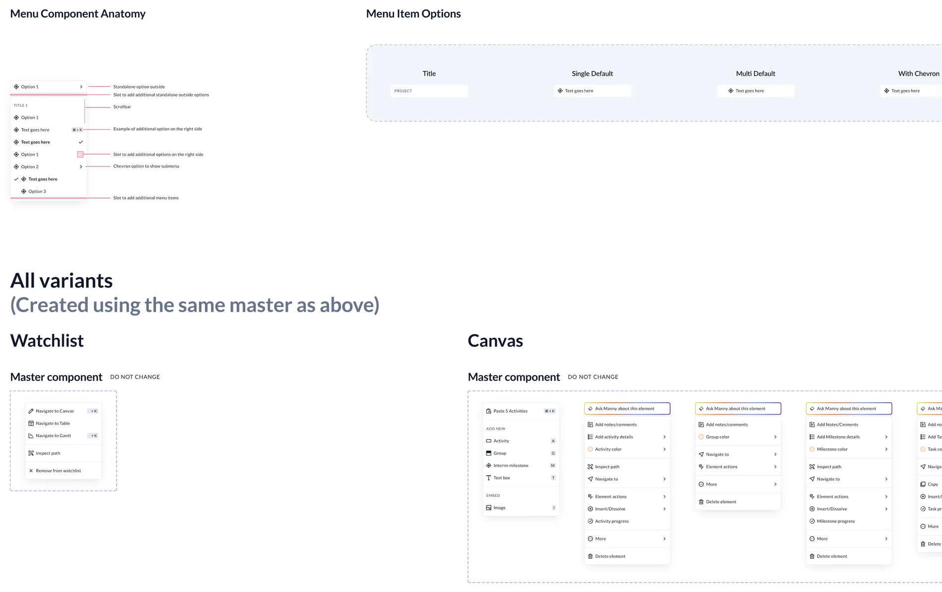
Menu as the master
Menu was the master, built once. Context menus for watchlist, canvas, gantt and table: each a variant carrying its own use cases. Change the master and all other menus inherit the changes.
Rebuilt around dev constraints
Where engineering had hard constraints, the component was rebuilt around them. Figma and Storybook ship the same thing.
Fixed by the team
Looking through components together in review surfaced redundant and incorrect usage. The team fixed each one, and the product got more consistent.
A seat in every design review
In the design sync calls, I watched for any deviation, anything that broke the pattern. For example, the same menu in two different modules had two different tooltips.
Engineering signed off weekly
Every Tuesday, I sat with the head of engineering to go through the components and how they were built. Dev sign-off happened weekly, instead of only when needed.
The numbers
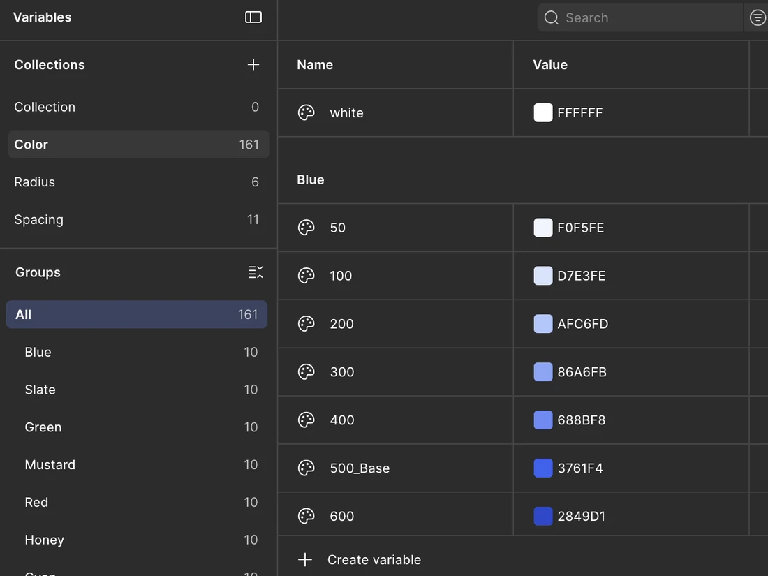
255tokens, up from about 130
100% use-case coverage, up from 40
29master components carrying every variant
265icons redrawn onto one grid
189dark mode mappings, zero component edits
A reference the teams use regularly
I built an interactive reference for every token, with the engineering team alongside me. Search a name, read its value, click to copy.
Spacing
Border radius
Border size
What I’d do differently
Ship the shadow conversion first
It was self-contained with a clear before and after. Instead I did it midway, so the devs felt weeks of change before they saw anything they could use.
Treat documentation like a deliverable
Write the documentation as I build each component, not after it's done. Early on I left it to the end, and every handoff to dev sat a couple of hours longer.
Project details
- Role
- Design system lead: audit, token architecture, components, dark mode, design review, dev QA, documentation
- Team
- Tristan Smith (Head of Engineering, Planera) · Travis (Head of Design, Planera)
- Client
- Planera, via NetBramha Design Studio
- Duration
- December 2025 to June 2026, ongoing
- Tools
- Figma variables and modes · HTML/CSS/JS for the docs · JSON for token mapping
- Status
- Live in production.
Next
01
Overhauling a 100-year-old bank’s mobile app
Fintech · Mobile App
Read case study →