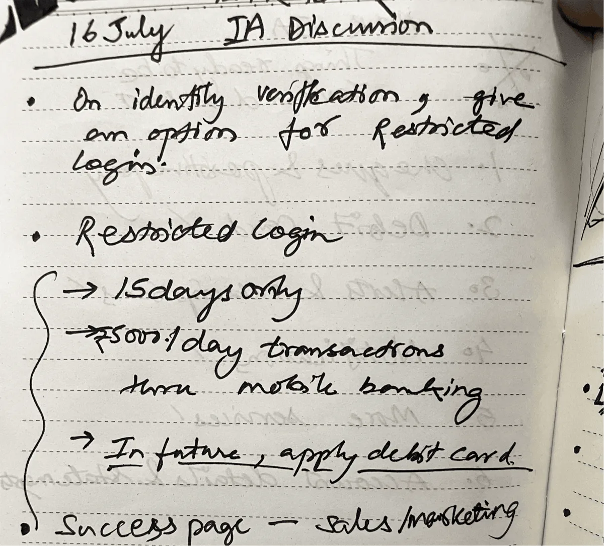
Overhauling a 100-year-old bank’s mobile app
FintechMobile AppIndia
Context
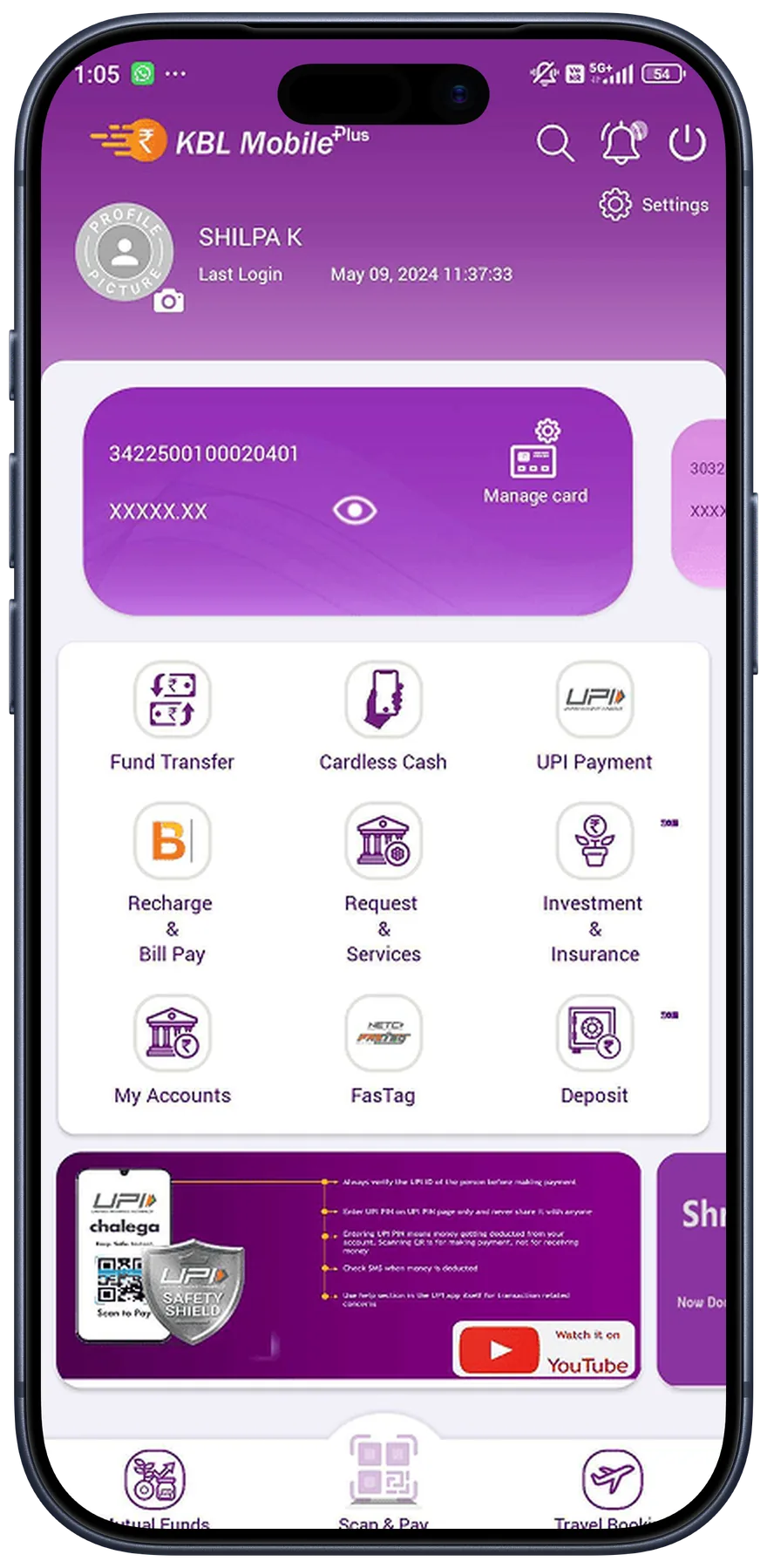
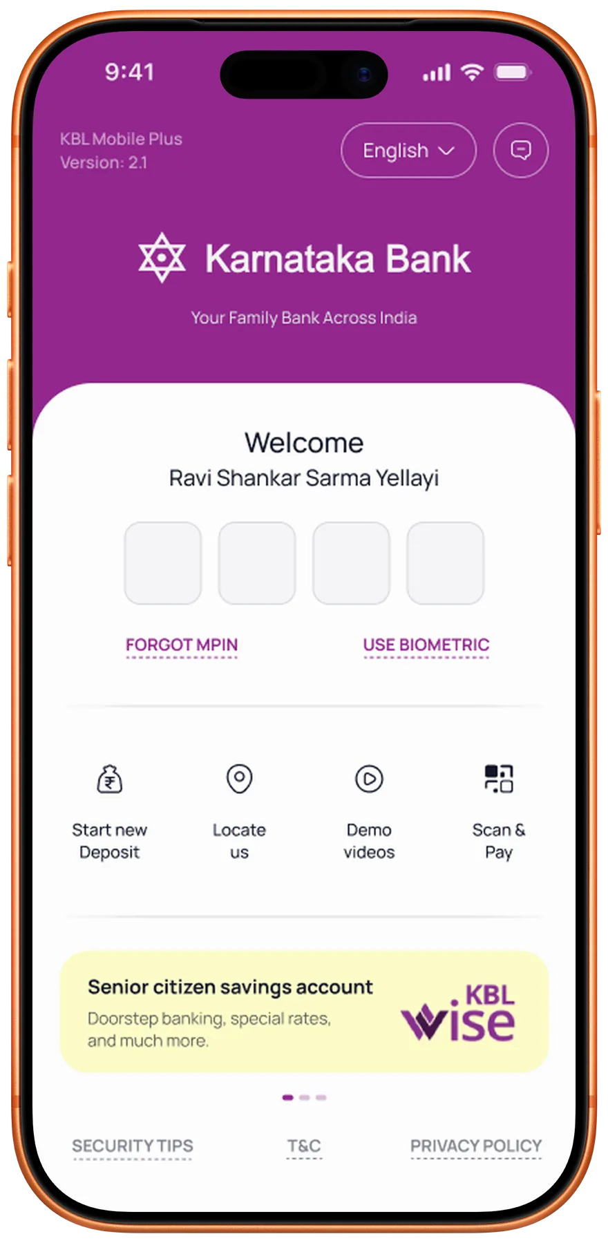
Founded in 1924, Karnataka Bank runs around 900 branches and serves over 13 million customers across India. KBL Mobile Plus is its main banking app, and for a growing share of those customers, the only branch they ever visit.
Summary
The app was losing a century of goodwill to 23 tangled modules and payments that ended in silence. I led a team of five designers through a ground-up rebuild: research in nine cities, three principles, four clear sections, and a design system the bank can extend on its own.
In alpha testing, user satisfaction rose 81%.
In this story
- 01What we heardHeuristic evaluation · Competitor benchmarking · User interviews
- 02What we choseDesign principles · Personas · Feature prioritisation
- 03What we builtInformation architecture · Interaction design · Design system · Dev handoff
- 04What it changedAlpha testing · Impact metrics · Retrospective
The team
Five designers on one side, a century of institutional process on the other. Everyone on this list had veto power over something.
- Design team
I led a team of five designers, from the first interview to the final handoff.
- Project Manager
Held scope, timelines, and the bank's expectations in one place so the design work could keep moving.
- C-Suite
The bank's decision-makers. Every major direction needed their buy-in before it went anywhere.
- Lead Engineer
The bank's authority on what the core systems could actually support, and what they couldn't.
- Dev team
The external iOS and Android teams who turned the designs into a shipped app.
The existing app was falling behind
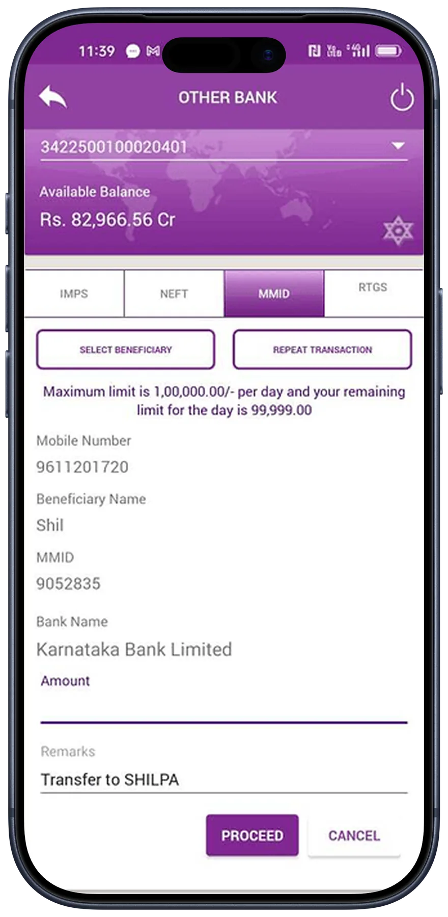
Passbook, payments, transfers, and account management each lived in its own module with its own logic. Basic tasks meant hopping between disconnected flows. The bank had a century of trust offline and was losing it one app review at a time.
Heuristic evaluation of the existing app showed us 84 issues across 12 usability criteria.
We scored five competitor apps on the same 12 criteria. The bank came in at 3.3 out of 5. The best competitor sat at 4.25.
| Category | Competitor A | Competitor B | Competitor C | Competitor D | Competitor E | Current KTK App |
|---|---|---|---|---|---|---|
| Overall Rating | 3.6 | 4.25 | 3.8 | 4 | 3 | 3.3 |
| Homepage | 3 | 3 | 3 | 3.5 | 2 | 3 |
| Account Details | 3 | · | 3 | 3.5 | 3 | 3 |
| Login | 3 | 3.5 | 3 | 3.5 | 3 | 3 |
| Fund Transfer | 3 | · | 3 | 3.5 | 3 | 3.5 |
| Bill Payments | 3 | 4.5 | 3 | · | 3 | · |
| Finance Manager | 3 | · | 3 | · | · | · |
| UPI | 3 | 4.5 | 3 | 3 | 3 | 3.5 |
| Deposits | 3.5 | · | 3 | 3.5 | 3 | 3 |
Scores based on heuristic evaluation across 12 usability criteria. Competitor names withheld.
We interviewed customers in nine cities. The same five complaints came up in every single one.
74%never found help on their own
A help section nobody could find
People hit a wall and had nowhere to turn. Support sat four taps deep, inside a menu most users never opened.
37%dropped off mid-task
Flows that kept breaking
Late OTPs, a lagging UI, sudden logouts. People abandoned payments halfway and started over from scratch.
61%were never warned of downtime
Downtime with no warning
Maintenance windows arrived unannounced. Most people found out when a payment failed.
32%found the text hard to read
Type too small to read
Senior citizens struggled with the default sizes, and they were almost 30% of the bank's customers.
41%finished payments unsure they went through
No definitive feedback
Transactions ended without a clear success or failure. The same uncertainty ran through most critical flows.
I send the money and then I just wait. Sometimes the SMS comes, sometimes it doesn’t.
What we heard, in different words, in nearly every city
It was clear what we needed to do
Three principles went up on the wall in week one. Every screen after that had to argue its way past them.
01Clarity
Every screen answers "what just happened?" without making you guess.
02Access
Core tasks within two taps, help available on every single page.
03Trust
Definitive feedback at every step, so no transaction feels uncertain.
The bank serves many kinds of customers. We agreed to design for three first.
- Millennial
Tech-savvy users who expected speed, modern UI patterns, and flows with no dead ends.
- General
The bank's largest segment. Needed clarity, trust signals, and accessible design.
- High Net WorthUnreleased
Premium experience with personalised nudges and direct access to relationship managers.
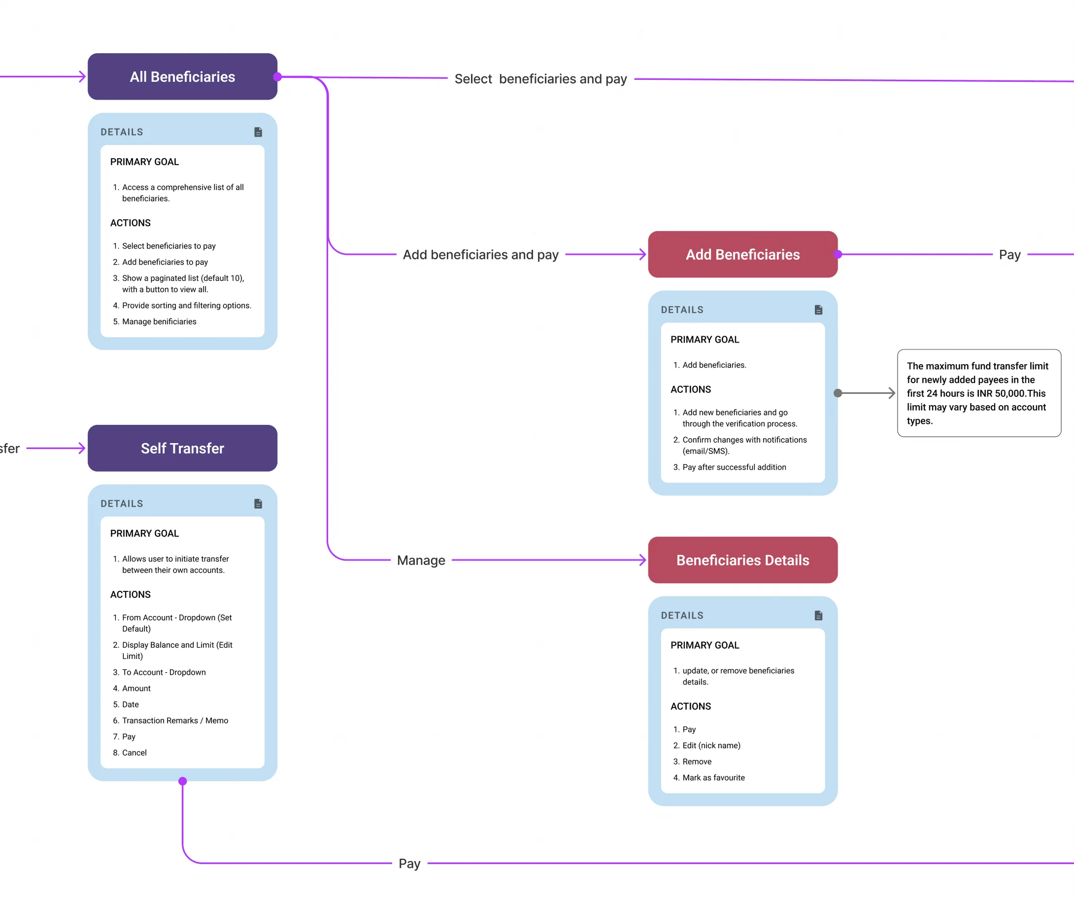
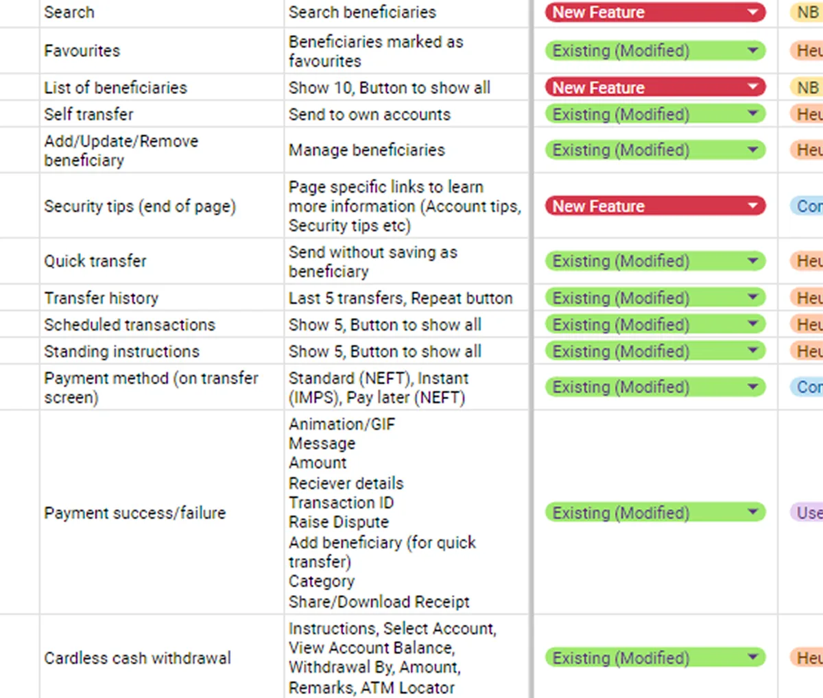
Untangling 23 modules into four clear sections
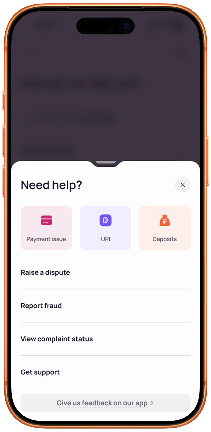
Twenty-three modules sat in a flat pile with no hierarchy, and reaching a basic feature took five taps. We rebuilt the whole structure around four sections, each shaped by a single user intent, and put help on every screen.
4sections, down from 23 scattered modules
2taps to any core feature, previously five
100%of screens now carry help, once buried in a menu
4 intent-based sections
Homepage9 modules
Search · Notifications · Accounts Summary · Debit Cards · Quick Links · Upcoming Payments · Spends Tracker · Rewards · Support
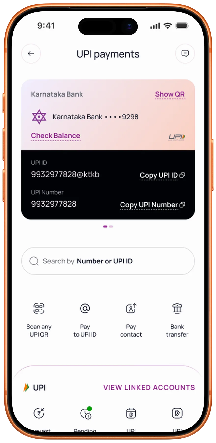
Payments6 modules
Fund Transfer · UPI · Bill Payments · E-Hundi Donations · Cardless Cash · Support
Finance5 modules
Spends Tracker · Assets · Liabilities · Rewards · Financial Tools
More5 modules
Profile · Account Management · Documentation · Transaction Services · Support
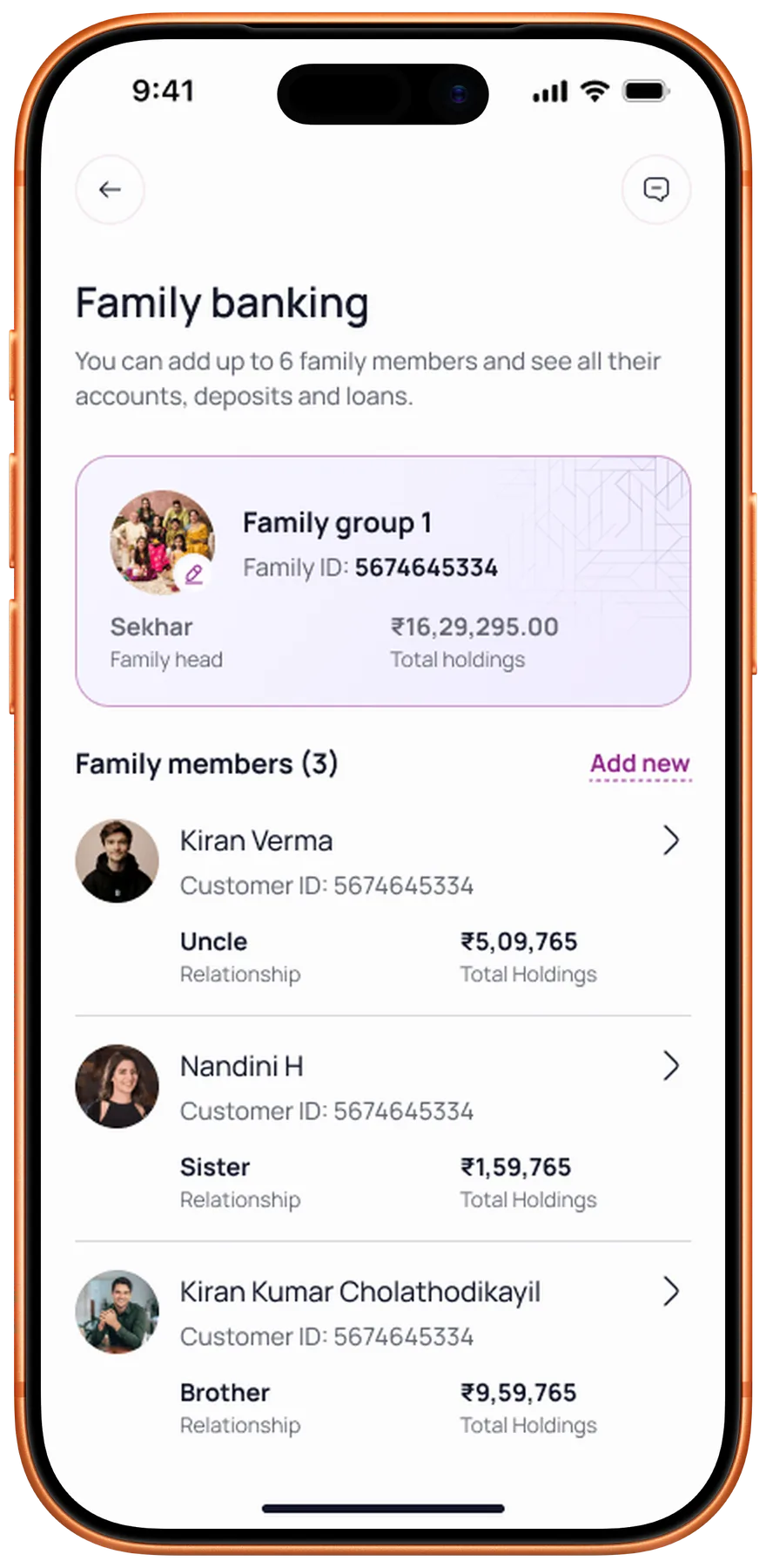
Building a dedicated view for the bank’s biggest revenue segment
SMB owners with multiple accounts were the bank’s biggest revenue segment, and they had no single place to see where they stood. So we gave them one. The Overview holds three things.
Relationship Value
TRV drives fee waivers, better rates, and priority service eligibility.
Business Accounts
All operating accounts with balances in one consolidated view.
Assets & Liabilities
Deposits, loans, and net position. No downloads or section switching.
Killing a feature at 90% to ship what matters
The team had nearly finished a smart budget tracker when the bank’s engineering leadership ruled the underlying tech unworkable. I made the call: drop it, and rebuild a leaner version on existing APIs. Same core value, none of the technical risk.
Bank pushback
Core banking couldn’t support real-time categorisation or webhooks.
The compromise
A batch-processed spending summary, refreshed daily instead of live.
Hindsight
I now check tech feasibility before spending a single design cycle.
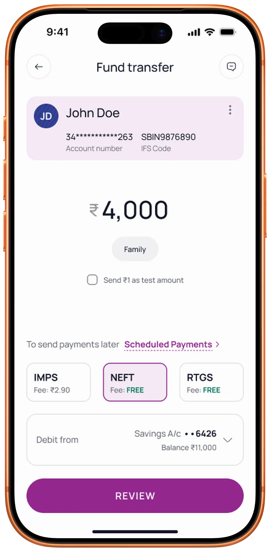
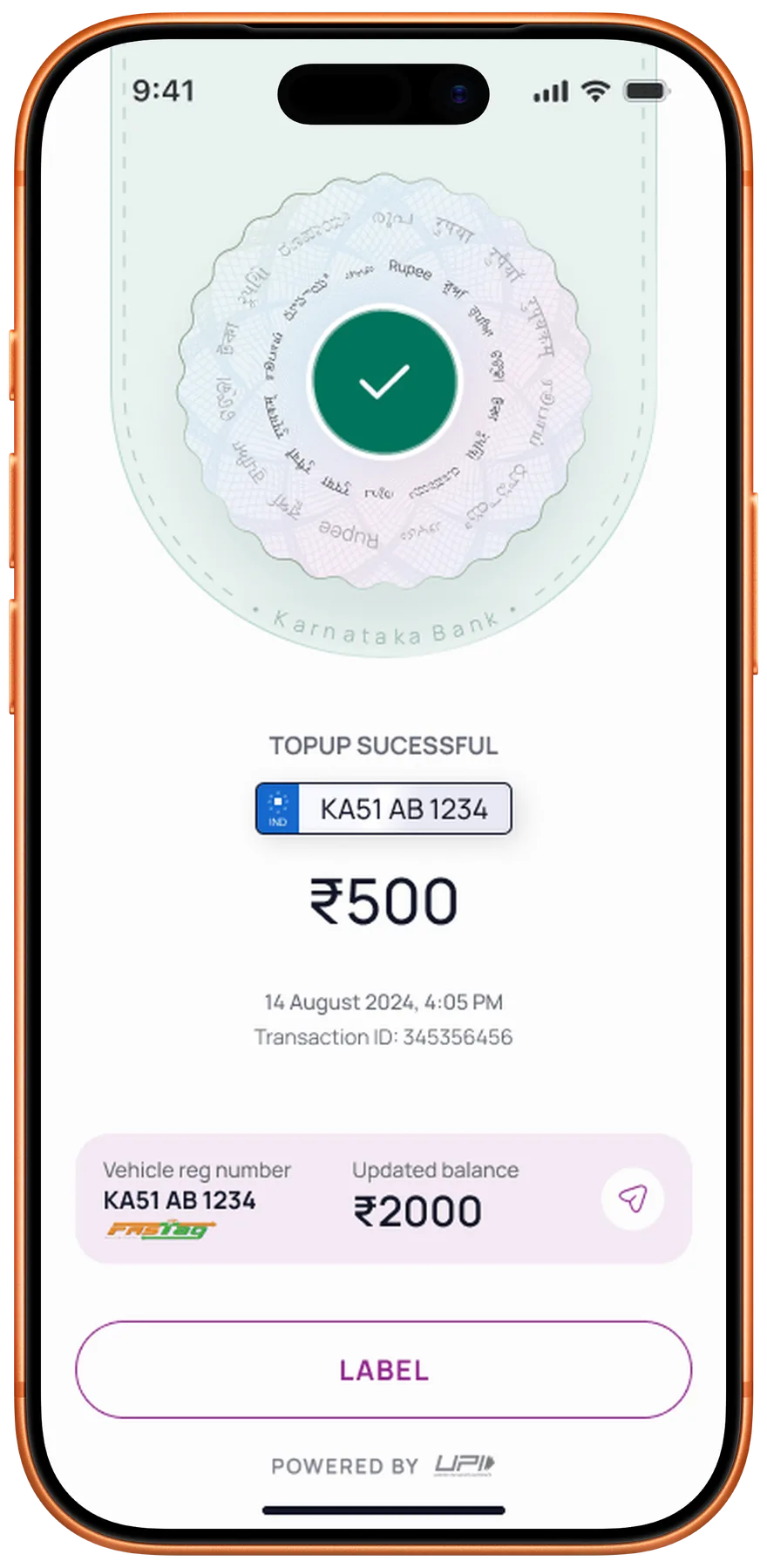
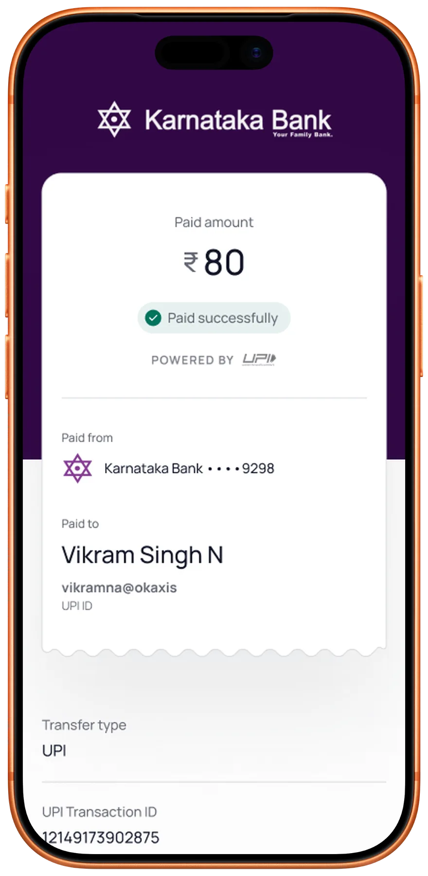
Removing the anxiety from every transaction
The old fund transfer flow asked people to send money on faith. The redesign made every step certain.
The redesigned flow
Easier to scan
Beneficiary, amount, and status are readable at a glance.
Send ₹1 test
Verify a new beneficiary before committing the full amount.
Fee transparency
NEFT, RTGS, and IMPS fees shown upfront on the review screen.
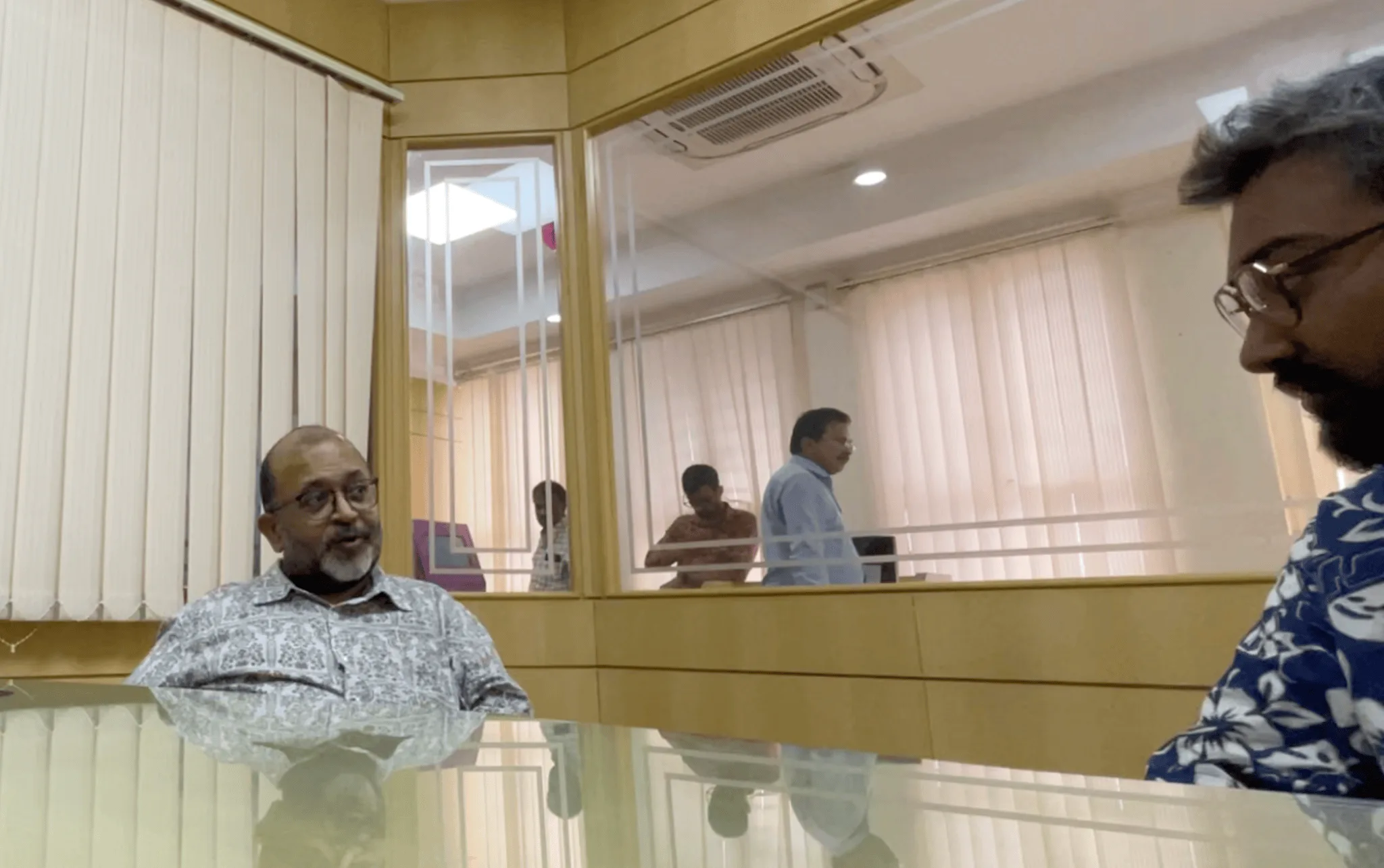
Speaking the developer’s language
Two builds came back broken: wrong fonts, pixel padding, margin mismatches. That meant visiting the dev office and sitting with both iOS and Android teams.
Being able to write code meant working in their environment directly. Reviewing variable initialisation, setting up relative padding, and making sure design tokens translated to production.
Their language
Worked with the iOS and Android teams in their own environments.
Documented
Specs, dev notes, and logic flows in a single Figma source.
QA’d builds
Reviewed each sprint’s output against the design specs.
A system the bank can keep building on
A 100-year-old brand identity and WCAG AA contrast in the same palette. The design system had to hold both, in light and dark.
Light
Dark
Measured in alpha with the bank’s internal user group
81%
increase in user satisfaction
50%
faster task completion
67%
fewer drop-offs
The screens that shipped
What this project changed about how I lead
Always presentation-ready
Enterprise projects move on their own schedule. Stakeholder calls happen when they happen. I built a habit of keeping screens updated and shareable within minutes. That responsiveness built trust with the client and became a standard I now hold across every project.
Designing for the organisation
A 100-year-old bank has deep institutional knowledge. Earning buy-in meant learning their language, understanding their constraints, and presenting ideas in terms they valued. That patience turned into alignment, and alignment turned into faster approvals.
Growing as a design lead
This project stretched my leadership skills more than any other. Onboarding designers mid-sprint, keeping the team focused through a dense workload, and connecting daily tasks back to the larger vision. The craft mattered, but the team management made me a stronger lead.
Project details
- Role
- Design lead: a team of five designers, from the first interview to the final handoff
- Client
- Karnataka Bank, via NetBramha Design Studio
- Team
- Five designers, the bank's project manager, C-suite, and lead engineer, plus the external iOS and Android dev teams
- Duration
- 4.5 months, 7 sprints
- Tools
- Figma, one source of truth for every sprint build
- Status
- Shipped. The app is live on the iOS App Store and Google Play.
Next
02
How do Indians decide who to trust with their money?
Fintech · Research
Read case study →