Frequent flow interruptions
Users are interrupted multiple times, resulting in user drop off. The breaks are because of delay in OTPs, lagging in the UI, sudden logouts, etc.
37%
of users
Team & My Role
The Challenge
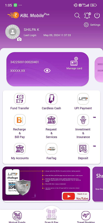
The app had fractured usability across separate modules for passbook, payments, transfers, and account management. Users navigated multiple disconnected flows to complete basic tasks.
Heuristic Evaluation
Competitor benchmarking
| Category | Axis | Cred | Jupiter | Kotak 811 | ICICI | Current KTK App |
|---|---|---|---|---|---|---|
| Overall Rating | 3.6 | 4.25 | 3.8 | 4 | 3 | 3.3 |
| Homepage | 3 | 3 | 3 | 3.5 | 2 | 3 |
| Account Details | 3 | 3 | 3.5 | 3 | 3 | |
| Login | 3 | 3.5 | 3 | 3.5 | 3 | 3 |
| Fund Transfer | 3 | 3 | 3.5 | 3 | 3.5 | |
| Bill Payments | 3 | 4.5 | 3 | 3 | ||
| Finance Manager | 3 | 3 | ||||
| UPI | 3 | 4.5 | 3 | 3 | 3 | 3.5 |
| Deposits | 3.5 | 3 | 3.5 | 3 | 3 |
Scores based on heuristic evaluation across 12 usability criteria
After completing a payment, the app sometimes showed no confirmation at all. Users received an SMS minutes later, if at all.
Most frequently cited issue from user interviews
Discovery
Interviews across 9 cities and in-branch sessions revealed what was truly broken.
Users are interrupted multiple times, resulting in user drop off. The breaks are because of delay in OTPs, lagging in the UI, sudden logouts, etc.
37%
of users
Users have reported not receiving notifications regarding scheduled maintenance, leading to unexpected service disruptions & inconveniences.
61%
of users
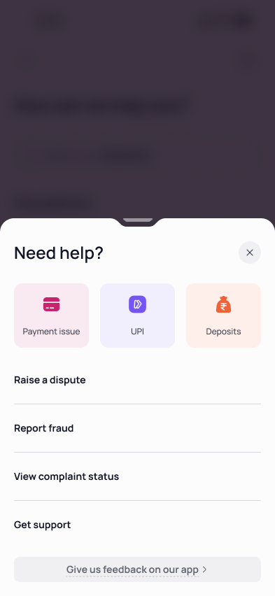
Many users, especially those new to mobile banking, struggled to locate the help section.
74%
of users
Many senior citizens found the default font sizes challenging to read. This was a problem because almost 30% of Karnataka Bank's customers were from this user group.
32%
of users
At the end of a transaction, users were unsure if the transaction was successful or not. And this was the case for many of the other critical flows as well.
41%
of users
Three personas shaped the redesign.
Tech-savvy users who expected speed, modern UI patterns, and seamless flows.
The bank's largest segment. Needed clarity, trust signals, and accessible design.
Premium experience with personalised nudges and direct access to relationship managers.
UnreleasedDiscovery
Strategy
Three principles guided every design decision.
Decision
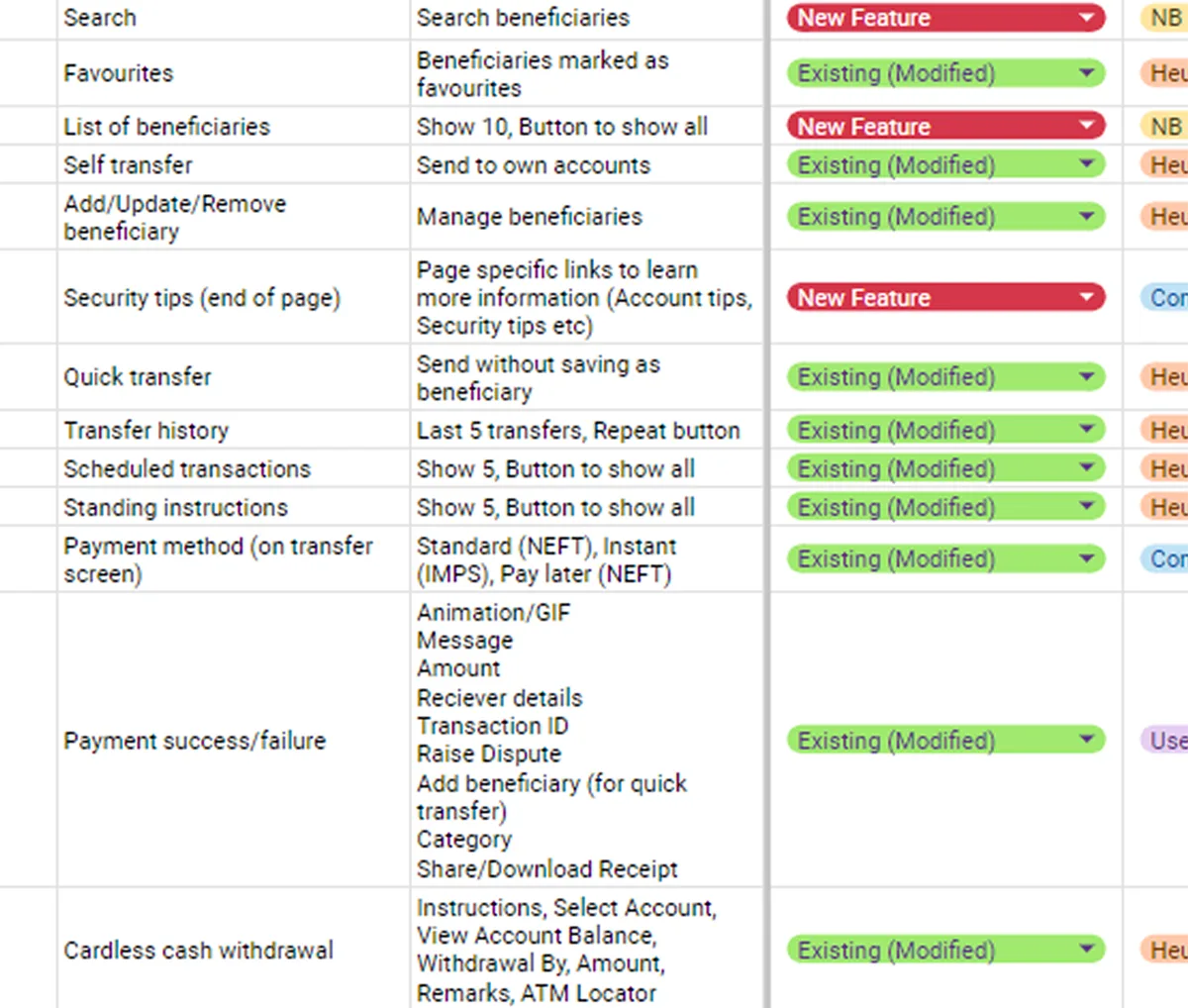
23 modules scattered with no hierarchy. 5 taps to reach a basic feature. No help section. All of it restructured into four sections, each built around a core user intent.
Homepage, Payments, Finance, More. Built around user intent.
Core features accessible within two taps from any screen.
Previously buried. Now accessible from every single screen.
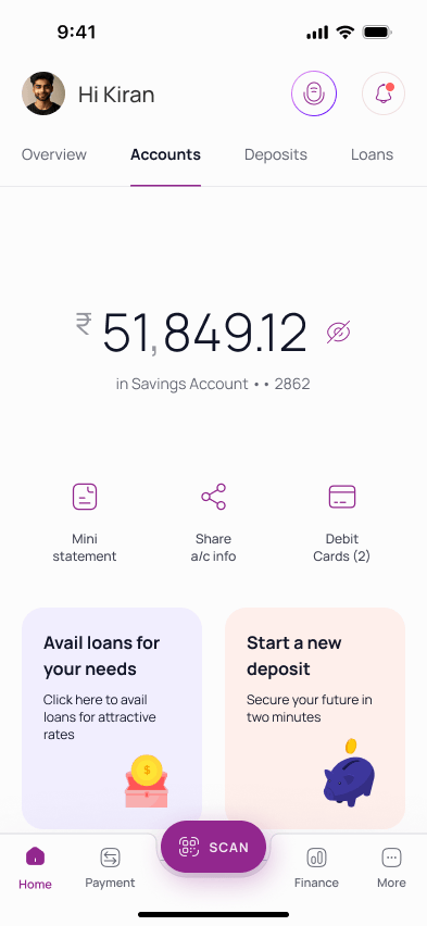
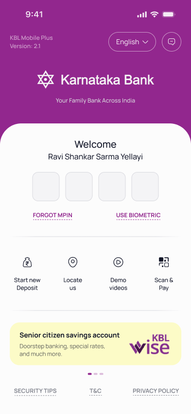
Homepage
Homepage
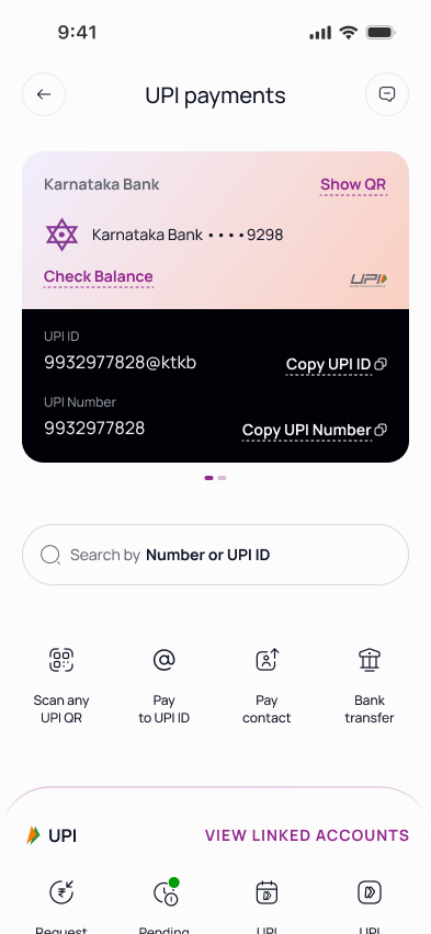
Payments
Finance
More
Decision
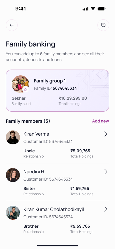
SMB owners with multiple accounts were the bank's biggest revenue segment, but had no consolidated view. This called for a dedicated Overview section.
TRV drives fee waivers, better rates, and priority service eligibility.
All operating accounts with balances in one consolidated view.
Deposits, loans, and net position. No downloads or section switching.
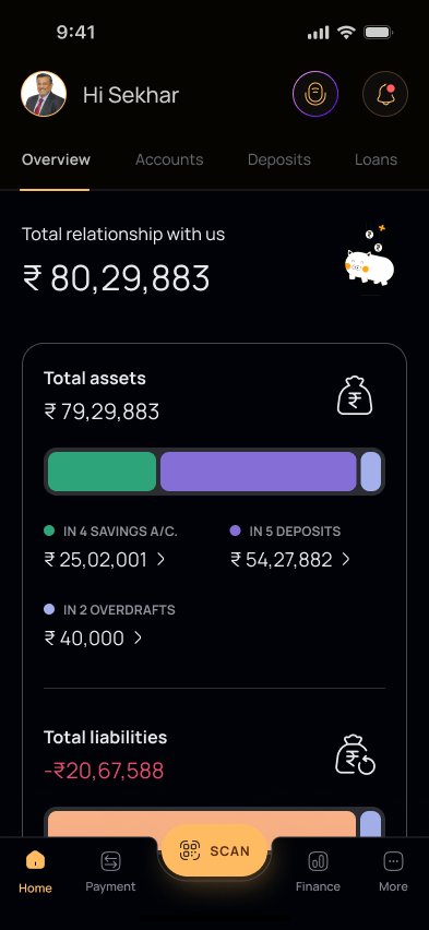
Homepage with Overview
Decision
The team had nearly finished a smart budget tracker when the bank's dev leadership ruled the underlying tech unfeasible.
The pivot: a leaner version using existing APIs. Same core value, no technical risk. Sometimes the right call is letting go of work that's almost done.
Core banking couldn't support real-time categorisation or webhooks.
Batch-processed spending summary. Refreshed daily instead of live.
Validate tech feasibility before investing design cycles.
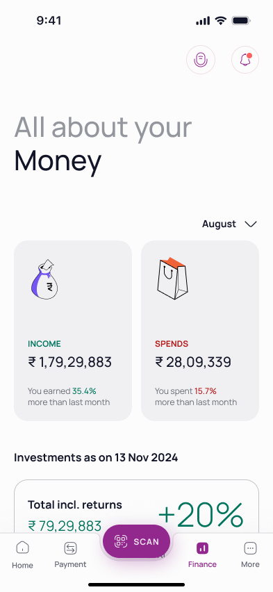
Spending Dashboard
Decision
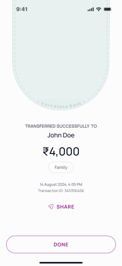
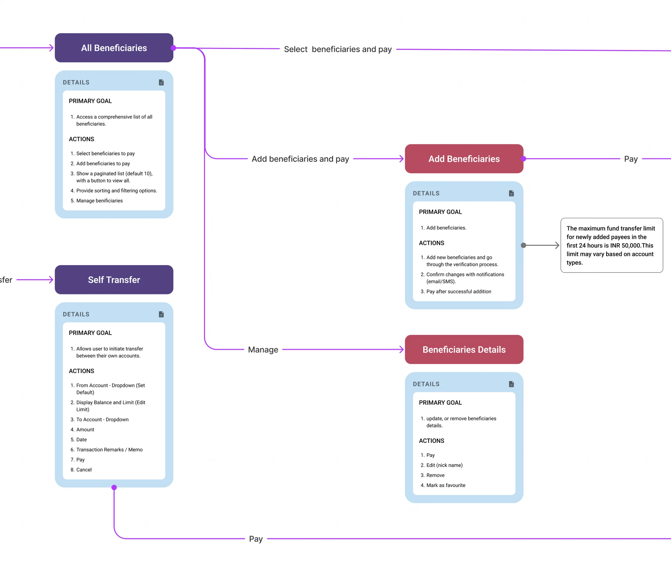
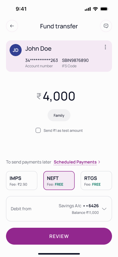
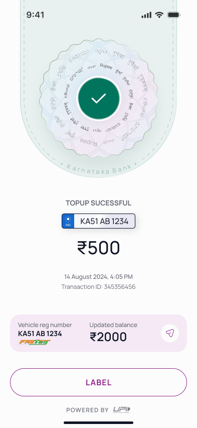
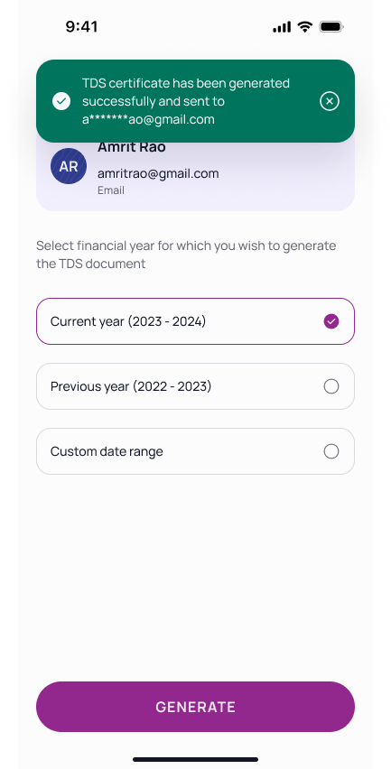
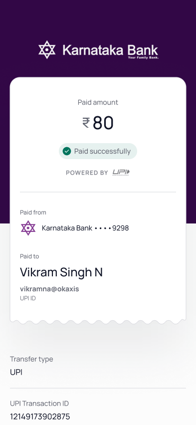
No review screen. No confirmation. Users submitted payments and waited for an SMS that sometimes never came.
The solution: review screens, definitive success/failure states, and a simplified process.
Beneficiary, amount, and status readable at a glance.
Verify a new beneficiary before committing the full amount.
NEFT, RTGS, IMPS fees shown upfront on the review screen.
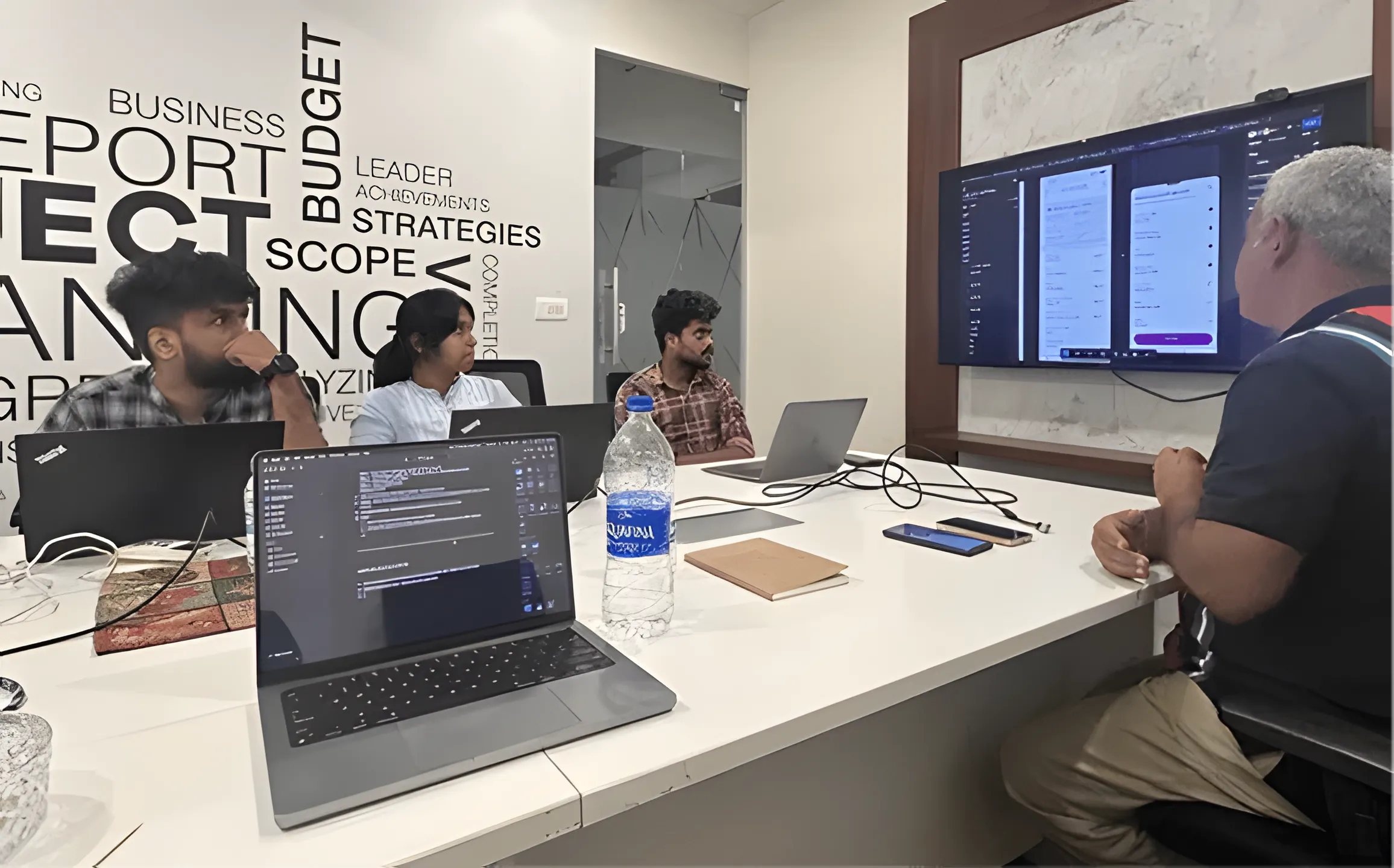
Execution
Two builds came back broken: wrong fonts, pixel padding, margin mismatches. That meant visiting the dev office and sitting with both iOS and Android teams.
Being able to write code meant working in their environment directly. Reviewing variable initialisation, setting up relative padding, and making sure design tokens translated to production.
Worked with iOS and Android teams in their own environments.
Specs, dev notes, and logic flows in a single Figma source.
Reviewed each sprint output against design specs.
Craft
Consistency and scalability called for a dedicated design system for Karnataka Bank's mobile app. The system balanced the bank's heritage brand identity with modern accessibility standards. Every colour choice was tested against WCAG AA contrast ratios, and the icon set comes in three variants to serve different UI contexts.
ABCDEFGHIJKLMNOPQRSTUVWXYZ
abcdefghijklmnopqrstuvwxyz
0123456789 !@#$%&*()?.,:;
Impact
Alpha testing showed an 81% increase in user satisfaction, 50% faster task completion, and 67% fewer drop-offs.
Currently in alpha testing with the bank's internal user group.
Screens
Reflection
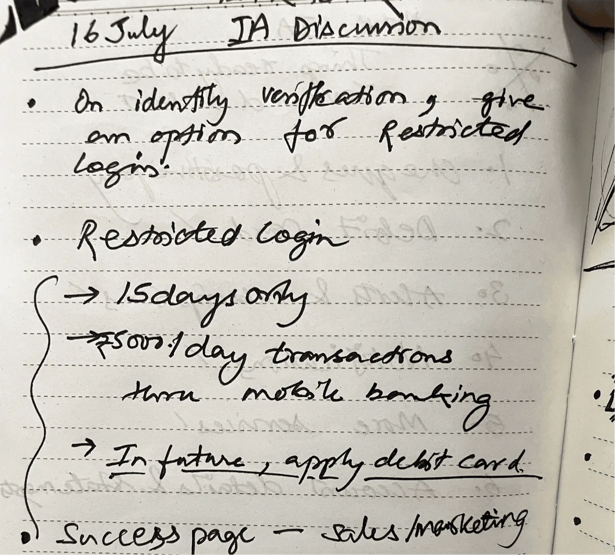
Enterprise projects move on their own schedule. Stakeholder calls happen when they happen. I built a habit of keeping screens updated and shareable within minutes. That responsiveness built trust with the client and became a standard I now hold across every project.
A 100-year-old bank has deep institutional knowledge. Earning buy-in meant learning their language, understanding their constraints, and presenting ideas in terms they valued. That patience turned into alignment, and alignment turned into faster approvals.
This project stretched my leadership skills more than any other. Onboarding designers mid-sprint, keeping the team focused through a dense workload, and connecting daily tasks back to the larger vision. The craft mattered, but the team management made me a stronger lead.